DataView Criteria Screen
The Criteria option switches to the DataView Criteria editing screen. This screen is used to define filters for the data by selecting which columns will be available for criteria settings, and the conditions for each available column.

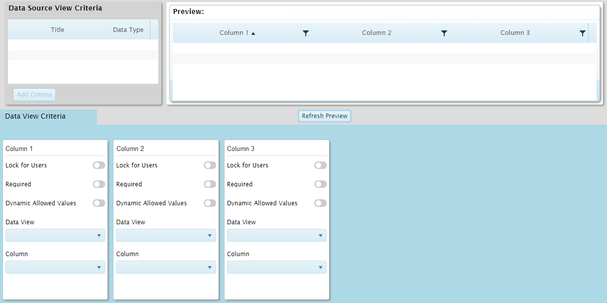
The screen is composed of three sections.

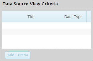
The Data Source View Criteria section lists the columns that can be used for criteria settings. The available columns are defined in the data source, and may not match the available data columns.
Select a column and click Add Criteria to add a column entry in the DataView Criteria section below.

The Preview section shows how the data will appear with the current settings. Click the Refresh Preview button to show the results of any changes.

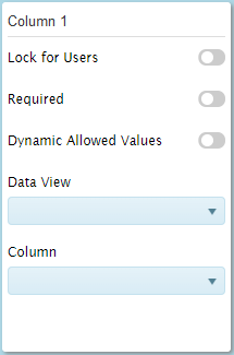
The DataView Criteria section displays settings for each column added to the criteria.
| Lock for Users |
When this option is enabled, this criteria can only be set in dashboard designer mode. It will not be visible in analysis mode. |
| Required |
This option is not functional at this time. |
| Dynamic Allowed Values |
When this option is enabled, a column from another dataview can be defined to provide the available criteria values. These values will be available in analysis mode when adding or modifying the criteria for this column. |
| Dataview |
When Dynamic Allowed Values is enabled, select the dataview containing the column with the dynamic values. |
| Column |
When Dynamic Allowed Values is enabled and a Dataview has been defined, select the column with the dynamic values. |
When hovering the mouse over a column detail panel, a control bar appears at the top of the panel.


|
Remove |
Removes the column from the list. |

|
Hide / Show |
Hides the column, but leaves it available for various functions. The column detail panel is collapsed to a narrow vertical bar with the Header label displayed. Click the collapsed panel to expand it again. The background will appear gray for hidden columns. Click the icon again to show the column. |

|
Collapse |
Collapse the column detail panel to a narrow vertical bar with the Header label displayed. Click the collapsed panel to expand it again. |

|
Collapse All |
Collapse all column detail panels to narrow vertical bars with the Header labels displayed. Click any collapsed panel to expand it again. |
